Higher Health
Inspiring success by improving wellbeing
For years, the Higher Education and Training Health, Wellness and Development Centre (HEAIDS) was focused on educating students and staff at post-school institutions about HIV, TB and STIs prevention and SRH promotion.
Over the years, the mandate of HEAIDS evolved, and a brand refresh became necessary to reflect this evolution.
The Brief
The Higher Education and Training Health, Wellness and Development Centre – known as HEAIDS – is a non-profit organisation that works alongside all public universities and TVET colleges in South Africa to develop programmes that promote the health and wellbeing of millions of students.
The organisation started life about two decades ago, as the HIV epidemic in South Africa was growing alarmingly and before treatment for AIDS was widely available. Over the years, HEAIDS broadened its scope of work from an HIV-centred initiative to a health and wellness programme, recognising the importance of a holistic approach to wellbeing. The COVID-19 global pandemic showed us ever more clearly the deep connections between health, economic, and education policy and the need for all three to be seen as parts of a coherent whole.
When we were approached to refresh the HEAIDS brand, we already understood the intersection between good health and educational output. For this reason, we wanted to update the HEAIDS brand in a way that still paid homage to its rich legacy of HIV/Aids education whilst also recognising the organisation’s growing mandate to champion the holistic development of students towards building a skilled workforce and economic empowerment.
We kicked off our efforts by developing a new communication strategy for HEAIDS, which culminated in a name change at the end of 2017, along with an integrated marketing campaign and roll-out plan.
Brand development
The transformation
A more meaningful name
We bid farewell to the name HEAIDS and introduced the name ‘Higher Health.’ In an industry faced with increasing challenges, we recognised that HEAIDS was much too limited a name to adequately reflect the organisation’s values and diverse community.
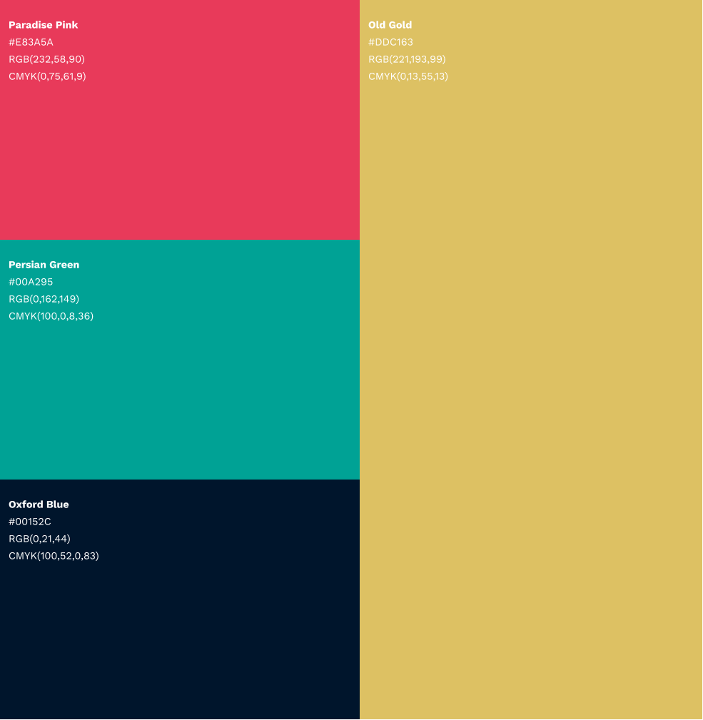
Unveiling the new visual identity
The brand mark combines a universal symbol for health, an information symbol and a book (as a symbol for growth) in a pattern that forms an H. If one looks closely at the logo, it also resembles two graduates shaking hands as if to congratulate one another.
Mental health matters
To secure a healthy future for SA, the government must adequately invest in the wellbeing and development of youth today. The new brand identity motivates students to become more proactive about their overall physical, emotional and mental health.


