UrbanBetter
Four strong brand identities for a powerful science mind
Professor Tolullah Oni is a Public Health Physician and Urban Epidemiologist, with a key focus on designing health into cities.
The brief
Born in Lagos, it is Prof. Tolullah Oni’s dream to make the world a better place by using Africa as a benchmark of how to fix cities, through formulas and studies that can be applied worldwide. In 2020, she founded UrbanBetter, a movement that builds healthy African cities and societies through expansive transdisciplinary partnerships and projects.
Prof. Oni has long had a significant academic impact on urban epidemiology on a global scale through her association with Cambridge University and the University of Cape Town – but without a distinct brand presence.
Our challenge was to create a standout brand identity for a movement, incorporating the existing academic legacy, assets, and values of Prof. Oni and her cohort of researchers (Oni et al). This involved dual name generation, brand positioning, logo development, website design, and the development of all social media profiles.
We developed website architecture to unify the four interconnected UrbanBetter identities (Cityzens, Academy, Oni et al., and UrbanBetter) into a cohesive and impactful identity for the Africa-led global movement. Each identity was given its own distinct look and feel, with custom functionality tailored to the unique needs of each entity. All sites are developed on the urbanbetter.science domain, each as a subdomain, to ensure their identities as pillars of UrbanBetter remained clear.
The most complex of these sites is Cityzens, the citizen science pillar of UrbanBetter. This platform enables Cityzens to engage at various levels by loading, joining, and managing upcoming campaigns or activations coordinated by UrbanBetter Cityzens Hubs. It also features a comprehensive training system where users can upskill, learning how to collect data using an air quality sensor or become Run Leaders to initiate activations and campaigns.
Additionally, the site includes a full Cityzens Toolbox, providing resources for hypothesising, collecting relevant data, and packaging it for use by government officials and researchers. To enhance accessibility and impact, the site also offers a global data visualisation tool, showcasing the data collected by Cityzens around the world.
We are moving forward in the scaling of Hubs, with the goal being 100,000 Cityzens and 100 Hubs in the next 10 years.
The transformation
Four brands. Complementary identities
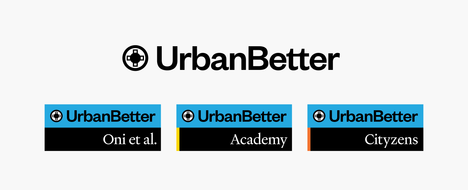
Leveraging our strategic and design expertise, BBA crafted a vibrant and cohesive identity to unify UrbanBetter’s four interconnected pillars: UrbanBetter, Cityzens, Academy, and Oni et al. Each pillar retains its unique identity while collectively amplifying the shared vision of building healthier, more equitable cities.
Universally relevant, rooted in Africa
Inspired by Adinkra – pre-colonial symbols from West Africa informed by universal aphorisms – we developed a logo mark for UrbanBetter that spoke to both health (through the visual of a cross) and urban spaces (through the visual of a dot encapsulated in a circle).
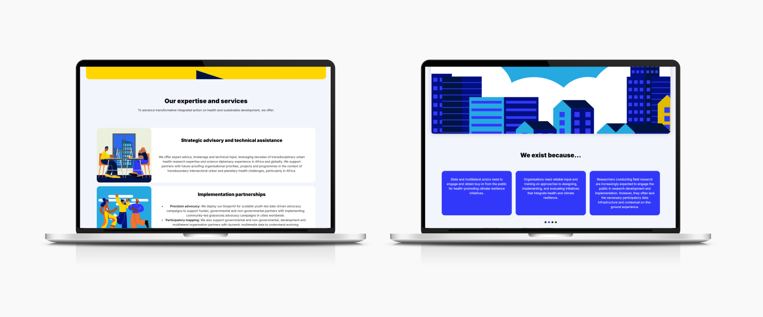
A seriously playful approach to platform design
We designed and built a digital platform that incorporated both the serious and playful elements of these brands. Using illustration and animation alongside photography, we illustrated and simplified complex topics.


